[All photos by BUILD LLC]
With each new project at the BUILD world headquarters, we like to select a couple of key areas and implement a few fresh and innovative design ideas. These tend to be specific and contained so that we can appropriately manage the cost and constructability associated with them. Reinventing the entire design and starting from scratch with each project has never interested us — we think of each design building upon the expertise and experience of previous designs. A series of incremental and deliberate moves allow the work to evolve carefully over time.
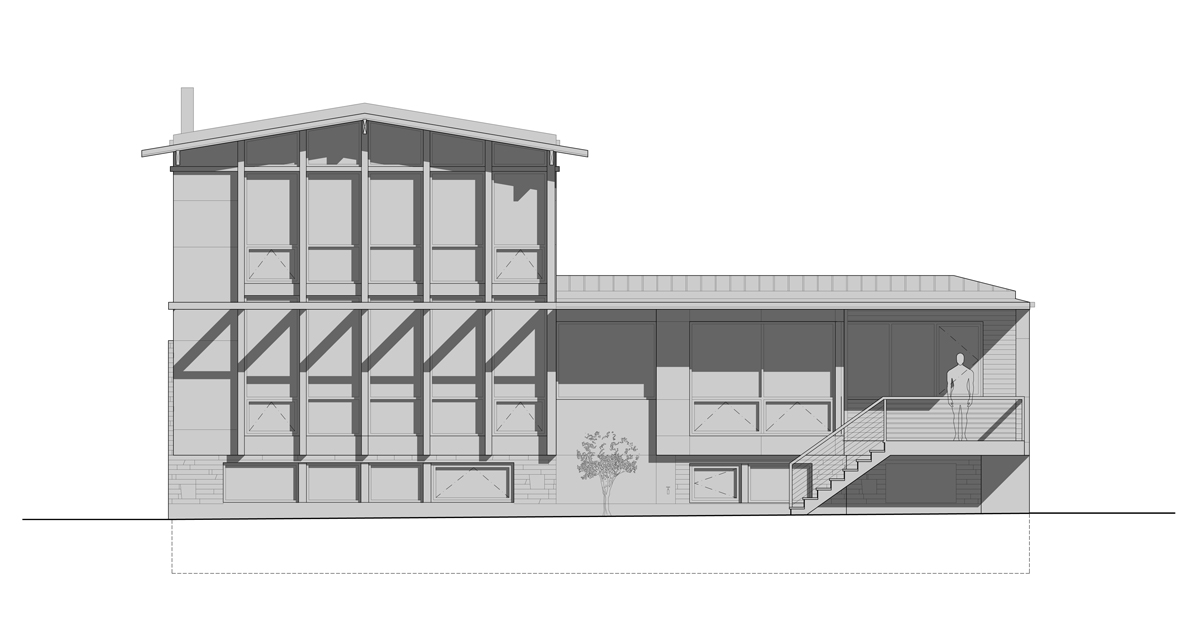
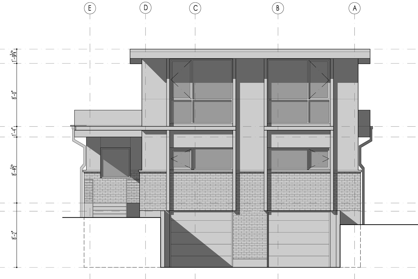
Two current residential projects illustrate this process of incremental innovation. Both houses prominently face a public way: one sits on a beautiful pedestrian-friendly street in Seattle’s Queen Anne neighborhood, the other resides on Magnolia Boulevard West — one of the most enjoyable walks/drives/bike rides in town on a sunny day. Both are remodels to mid-century modern structures and both require a certain level of elegance and prominence in how they front the street. Design-wise, we wanted the façades to indicate the regularity of the structure occurring within. Supplementary to this was bringing certain features out and pushing others back, developing a harmonious geometry and a layering of shadow lines.
As with most design moves, we look to the work of the master architects — it’s amazing how many design challenges have already been solved by previous generations of architects. For this design exercise, the work of Pacific Northwest modernist Ralph Anderson seemed significant, and we studied up on some of his celebrated residential projects in the area. The concept of vertical and horizontal relief are so well-developed in his projects that they’ve become textbook lessons in geometry. There’s no better learning tool than built work, and these projects answer a handful of important questions: Which lines carry through and become most prominent in the hierarchy? Which lines are pushed back? What are the proportions and surface treatments?
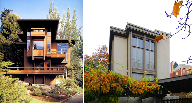
[Runion Residence & Pifer House designed by Ralph Anderson]
Knowing the finished qualities we were after and having picked apart built works that we admire, we were ready to dive into our own details. Our site superintendents are in the office enough and we’re in the field enough that brief conversations can occur to brainstorm design ideas and figure out how to best construct new details. A few minutes of time from the framer can save hours in the office and this example was no different. Thanks to Scott, one of the ninja framers on site, we worked out a simple and straight-forward detail to provide the results we were after.
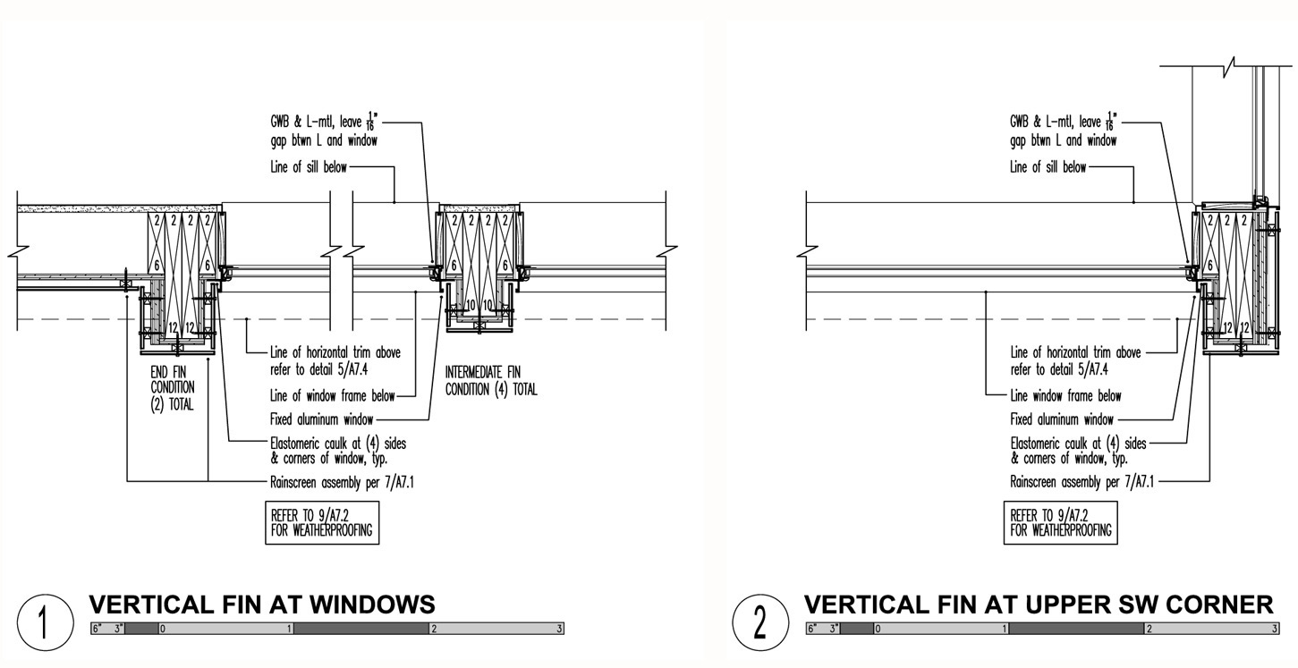
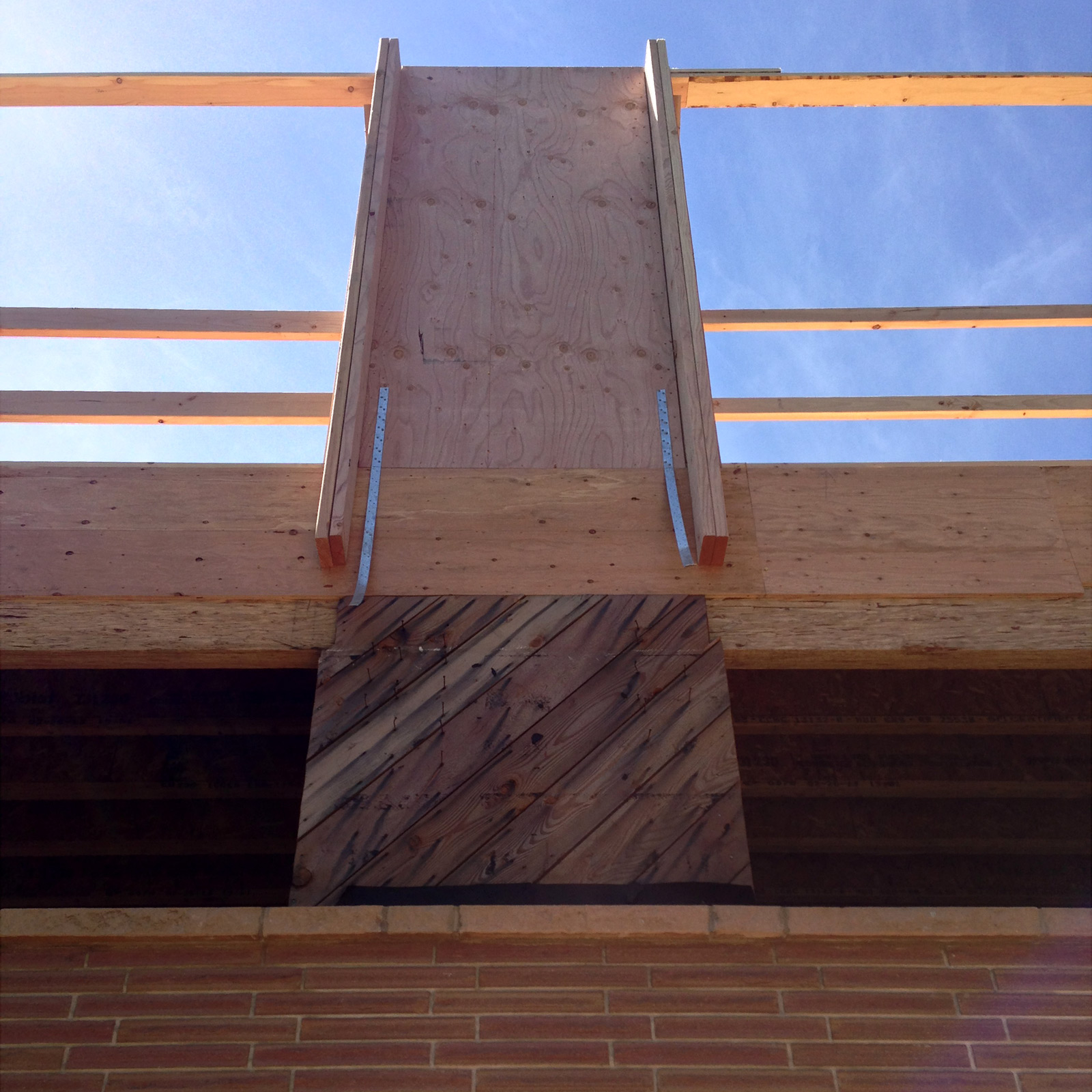
We tweaked our standard window details so that the framing members on each side and in between windows (typically 2×6 members) were replaced with 2x12s. The extra depth extends beyond the siding to create vertical fins, adding about 6” of relief to the façade. 2×6 members on each side of the 2×12 fins allow for attachment of the window flanges. These fins are then wrapped with a rainscreen application similar to the adjacent walls.
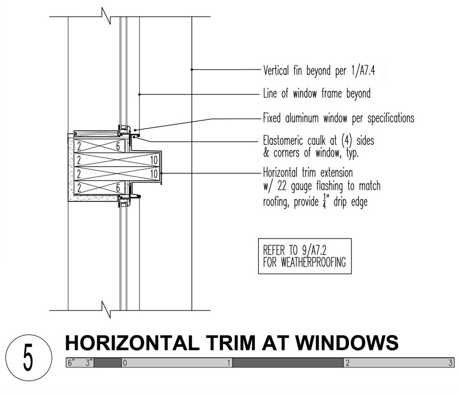
Similarly, at the horizontal trim, the 2×6 top plates are replaced by 2x10s which extend past the siding of the building giving the composition a racing stripe and adding a bit of deliberate shadow line. At this application, however, the extension is wrapped with a 22 gauge flashing to match the roofing. (Don’t forget the drip-edge.)
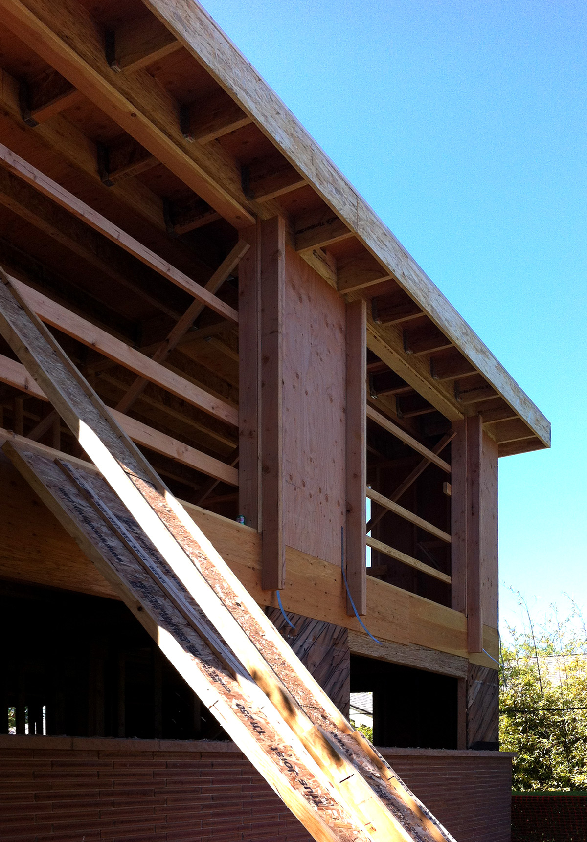
Both the horizontal and vertical details establish an elegant geometry, extending the framing and structure which are already integral in the remodel. These details create multiple layers of shadow lines which add to the depth and sophistication of the façade. Simple incremental design moves like this allow for the constant evolution of design while minding the constructability, schedule, and budget.
For regular updates on the construction progress, connect with us on Facebook.
Cheers from Team BUILD